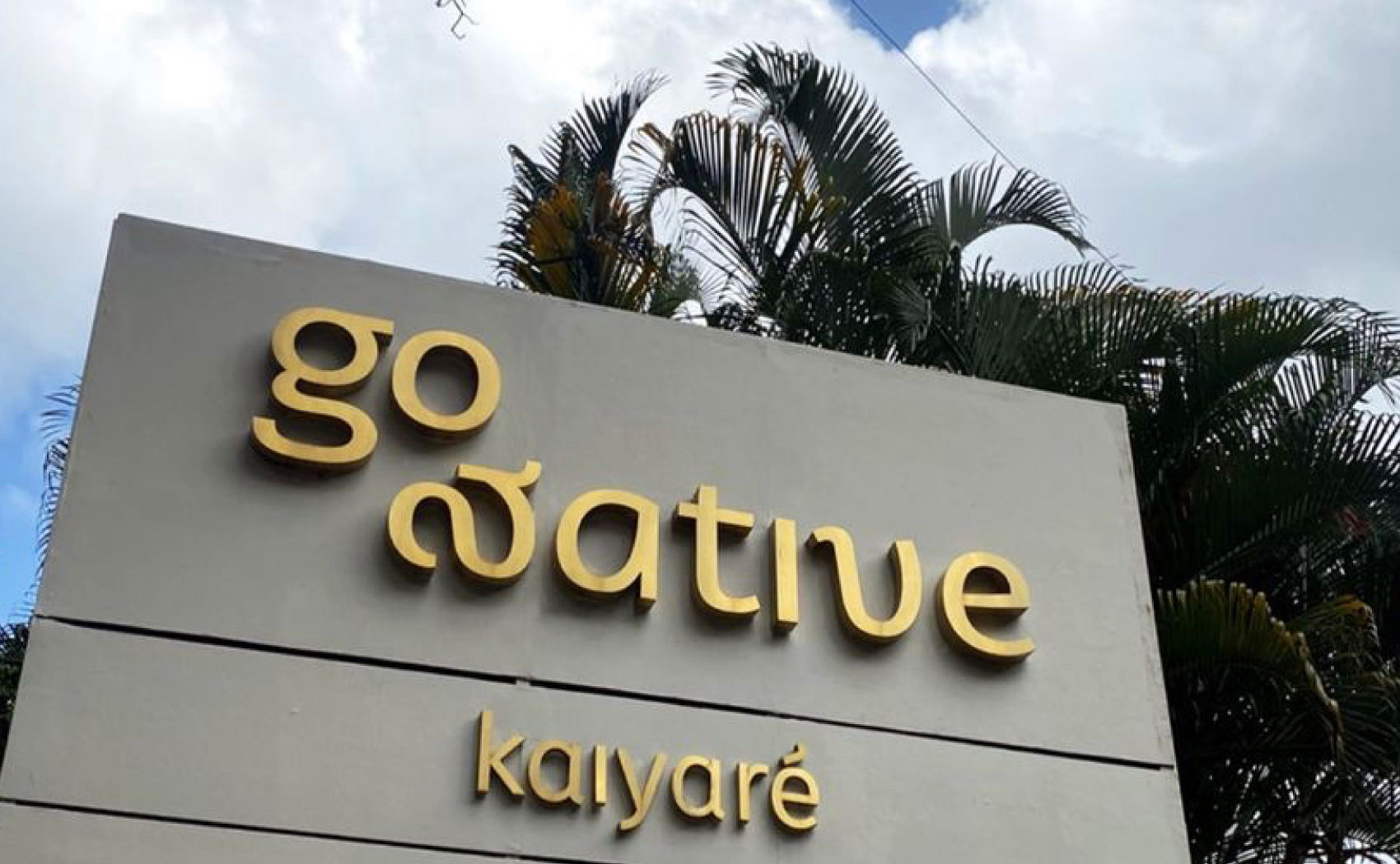
Go Native
LIFESTYLE / RETAIL
Brand Identity + Digital + Illustration + Signage + Spaces +
Mixing the handmade and the digital, the indigenous and the contemporary in a bilingual identity for Go Native, an organic lifestyle brand that brings together gentler alternatives for every need.
Design: Aparna Ranjan Writing: Pooja Agarwala Illustration: Sagarika Bhatia
Photography: Shalini Siva Prasad
Client: Go Native LLP
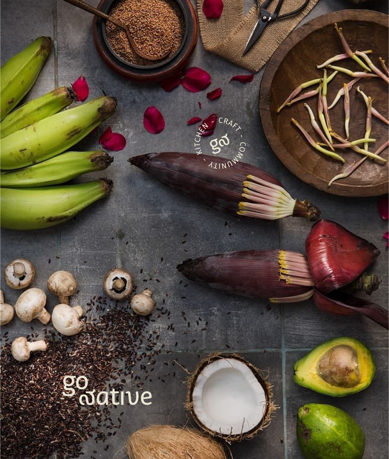

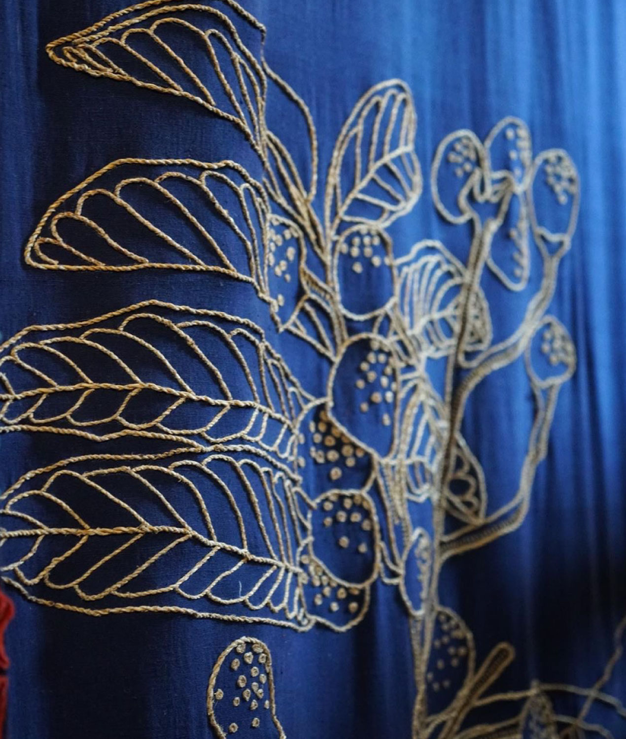
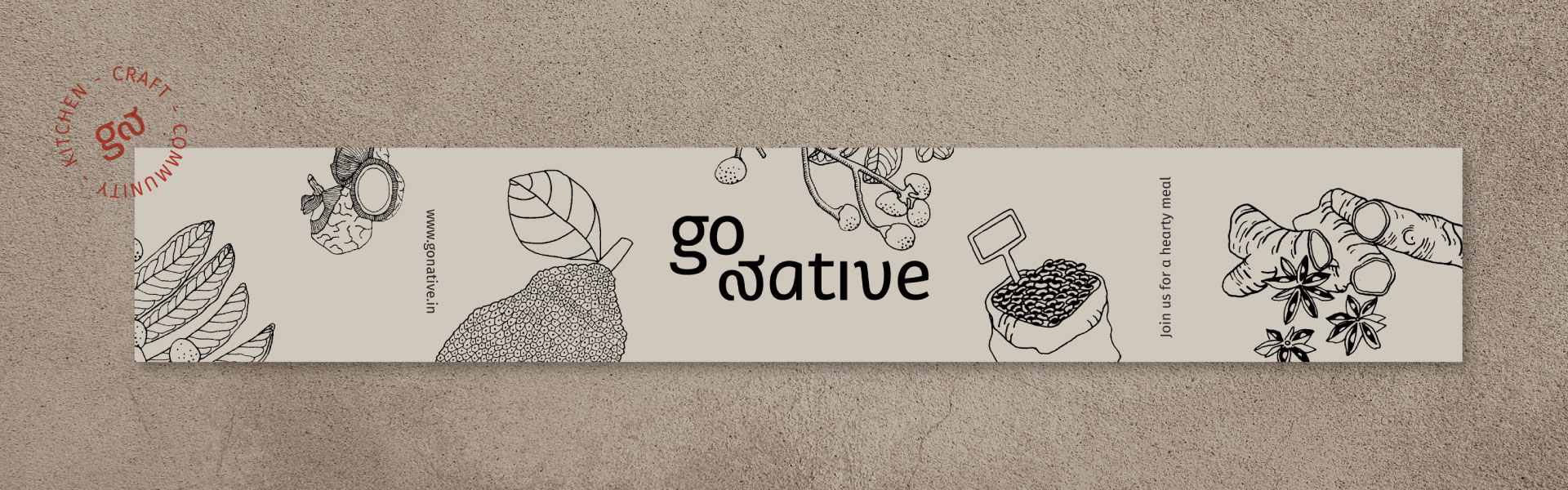
Interpreting the word ‘native’ through objects filled with context and memory. Part of our endeavour was to deal with deeper concepts of sustainability in a visual form – making it feel more familiar than daunting, inciting discovery and engagement.
![]()
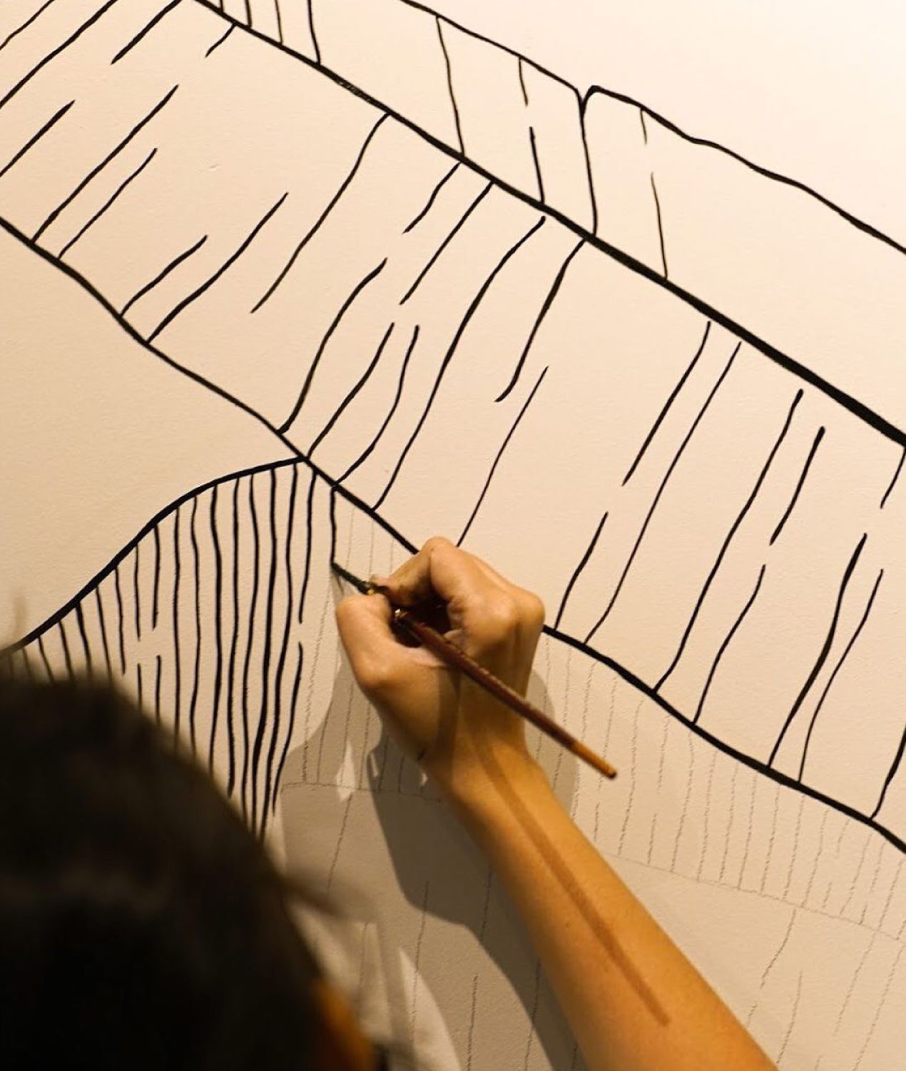
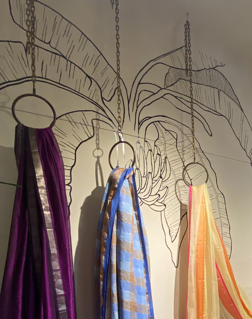
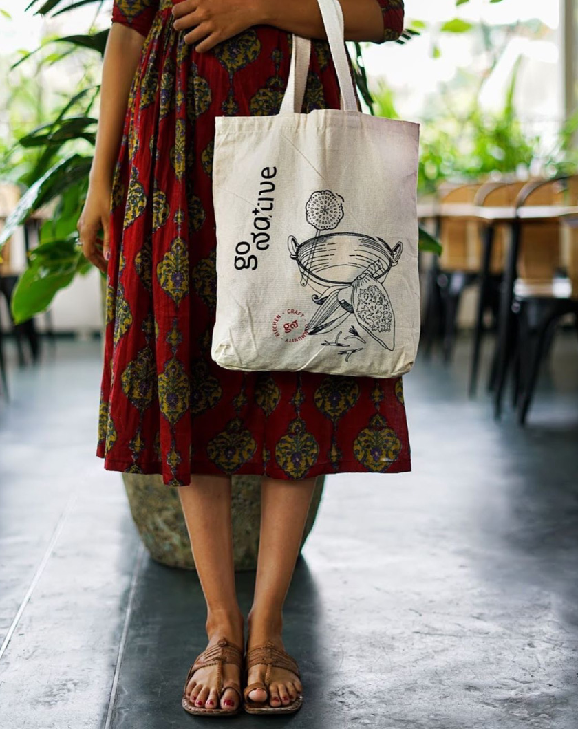
An illustration style that acquires more character as it changes hands, and finds new expression in different materials and techniques. Free-wheeling and evolving, learning and growing while exploring its own interpretation of organic, natural and handmade.


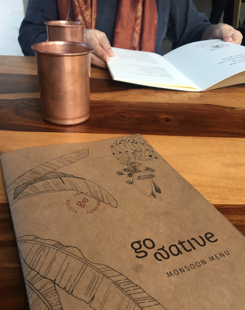
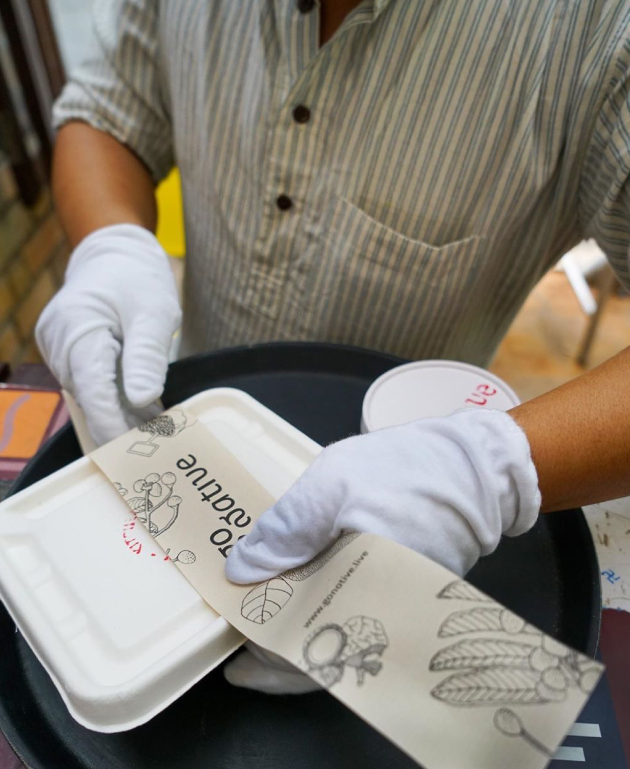

A different kind of minimal, we wanted the branding to add charm without generating more waste. Biodegradable containers with a paper wrap and seal that can be photocopied, screen-printed, even cyclostyled on recycled paper. Small enough to sneak into those unused spaces in large print runs as well. Super functional take-away packaging but low power and low waste.

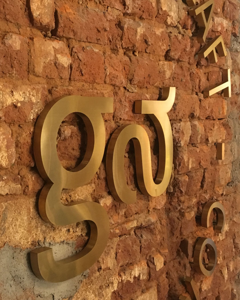
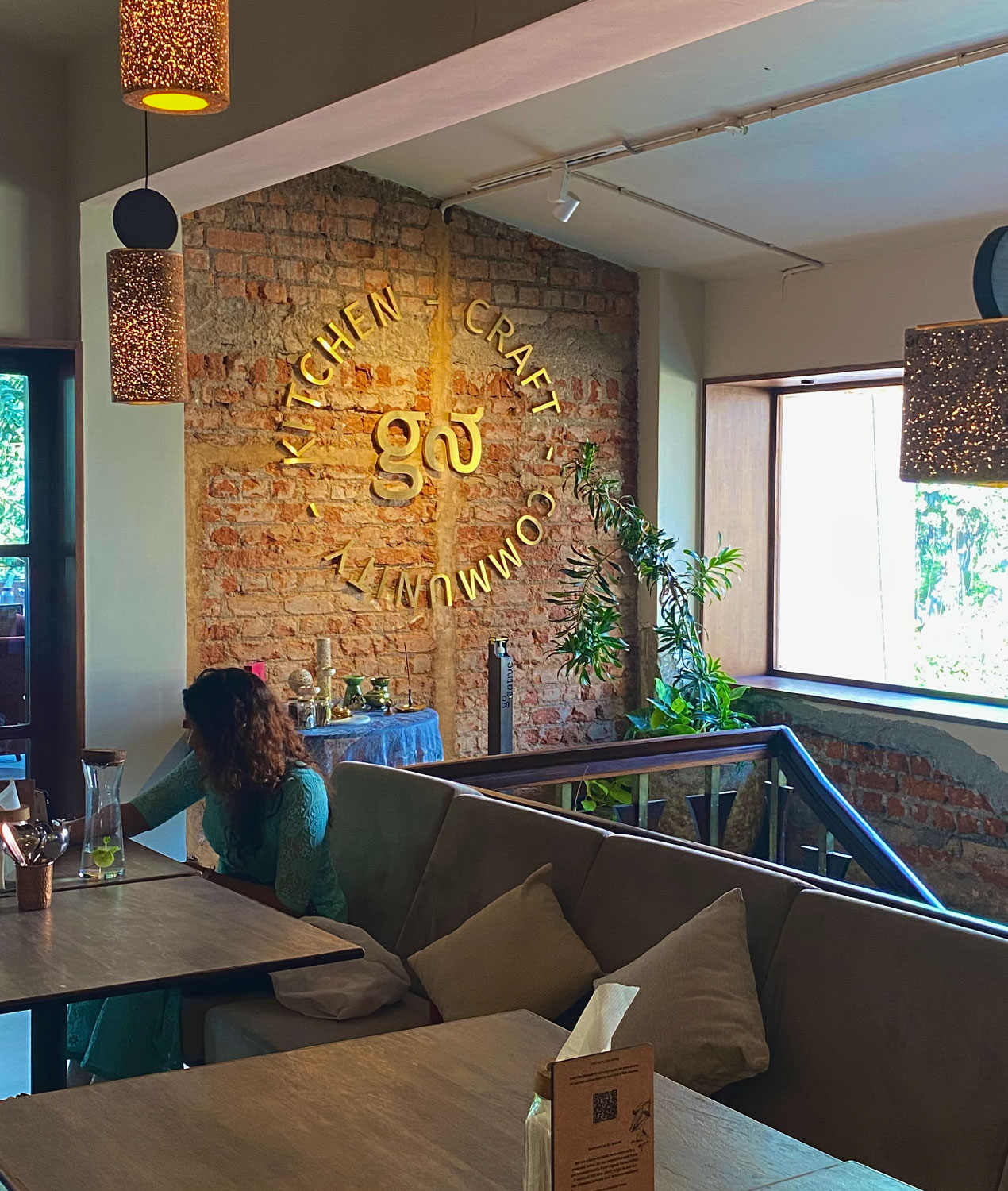
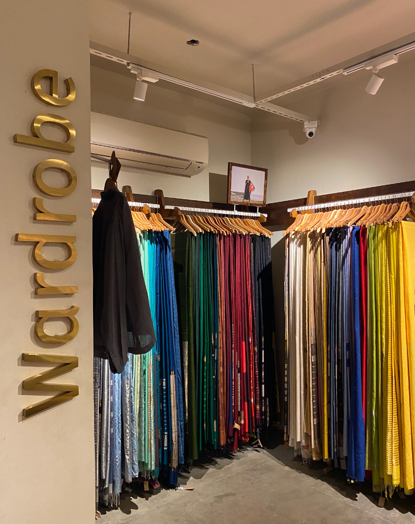
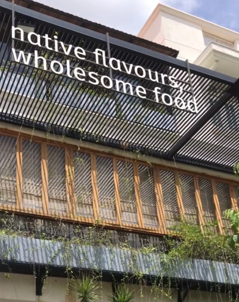
Signage and spatial graphics that translate the brand language into the retail environment. Each Go Native location is unique, and varies in architecture and interior expression. A few brand elements stay consistent to ensure a unified experience without prescribing a cookie cutter approach.