Ruchira Papers
PAPER / MANUFACTURING
Brand Identity + Editorial & Print + Illustration +
Corporate brand refresh, product branding and packaging for Ruchira Papers – a contemporary paper farm in the heart of Himachal, actively working towards being one of the greenest papermakers in the industry.
Design: Aparna Ranjan Illustration: Sagarika Bhatia Writing: Rheea Mukherjee
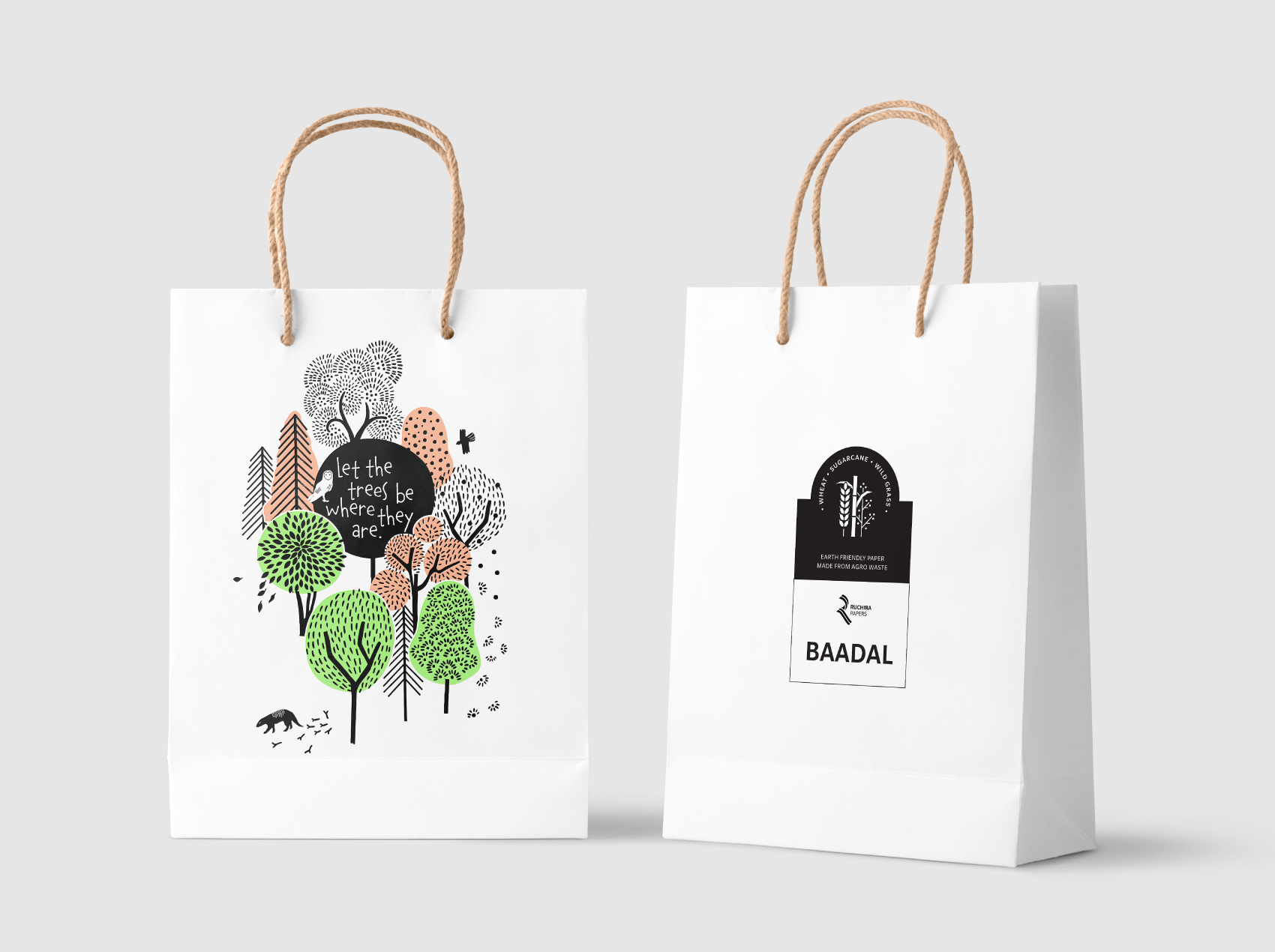
Client: Ruchira Papers Limited
![]()
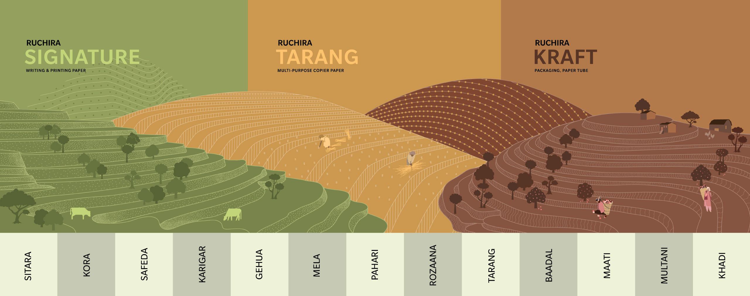
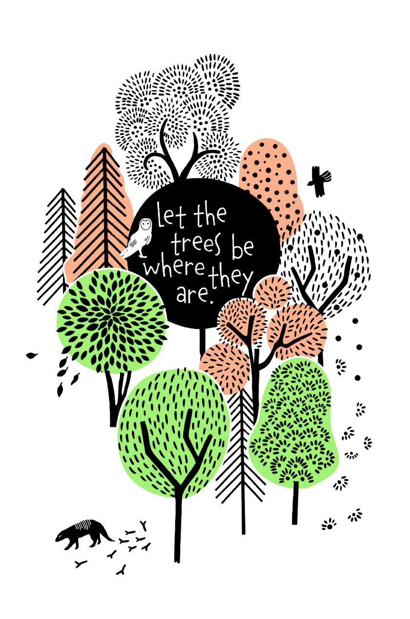
The goal was to build a new vocabulary for the brand – not just changing the way it looked and felt, but making its most important values visible, and placing these at the heart of their business.
![]()
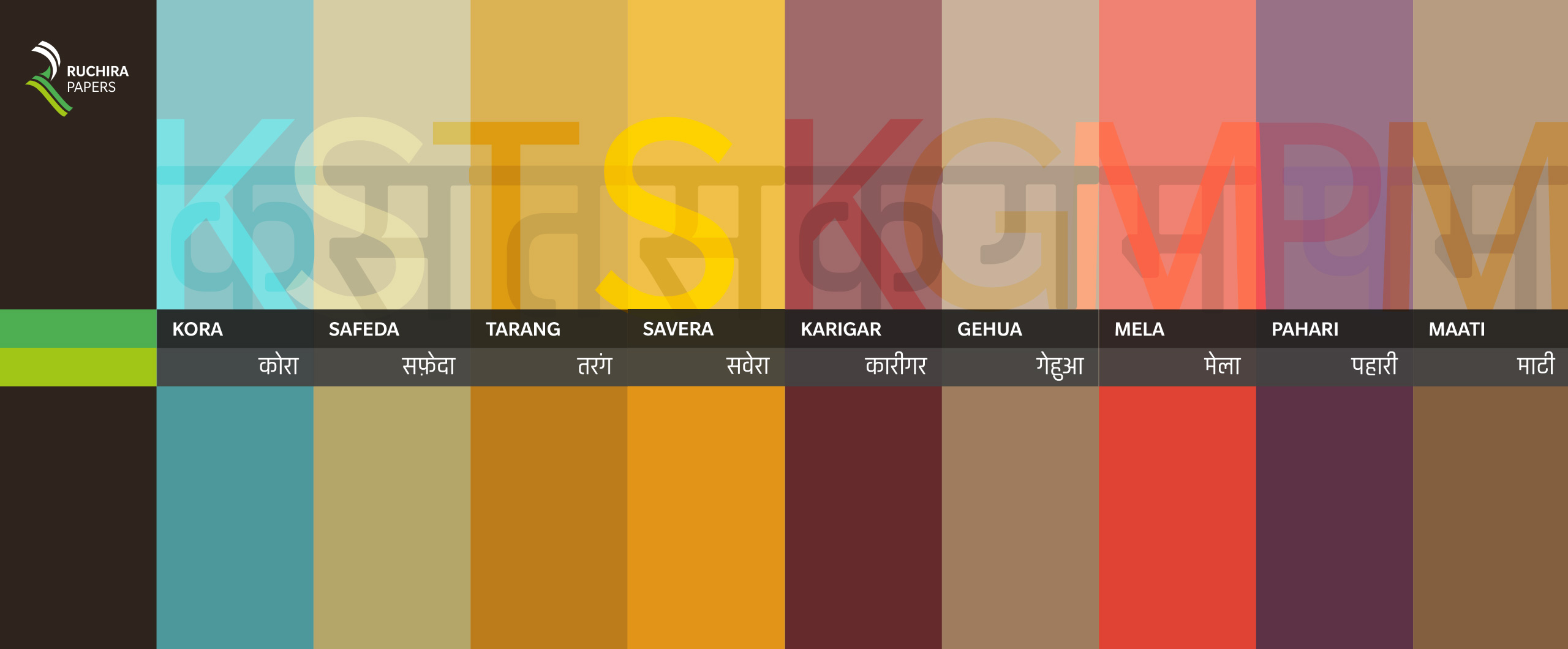
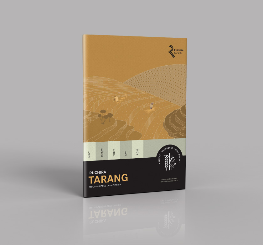
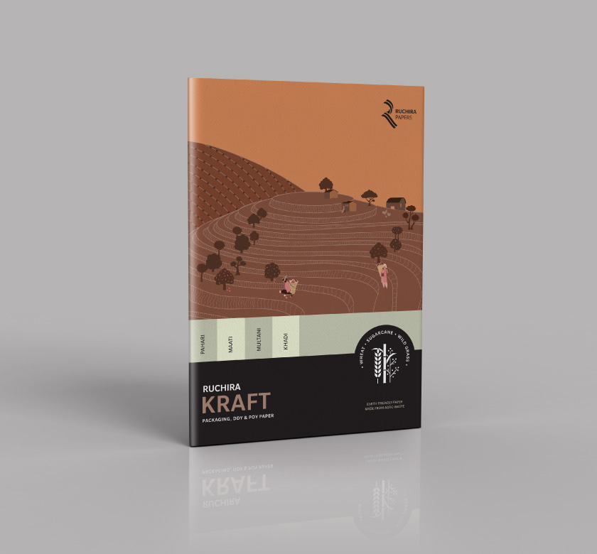
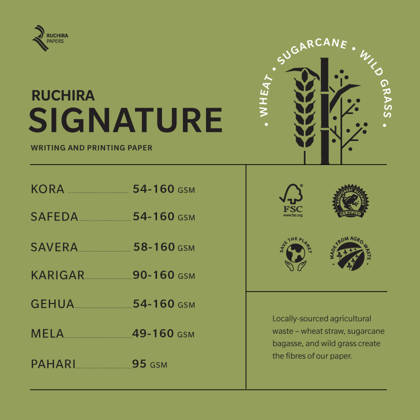
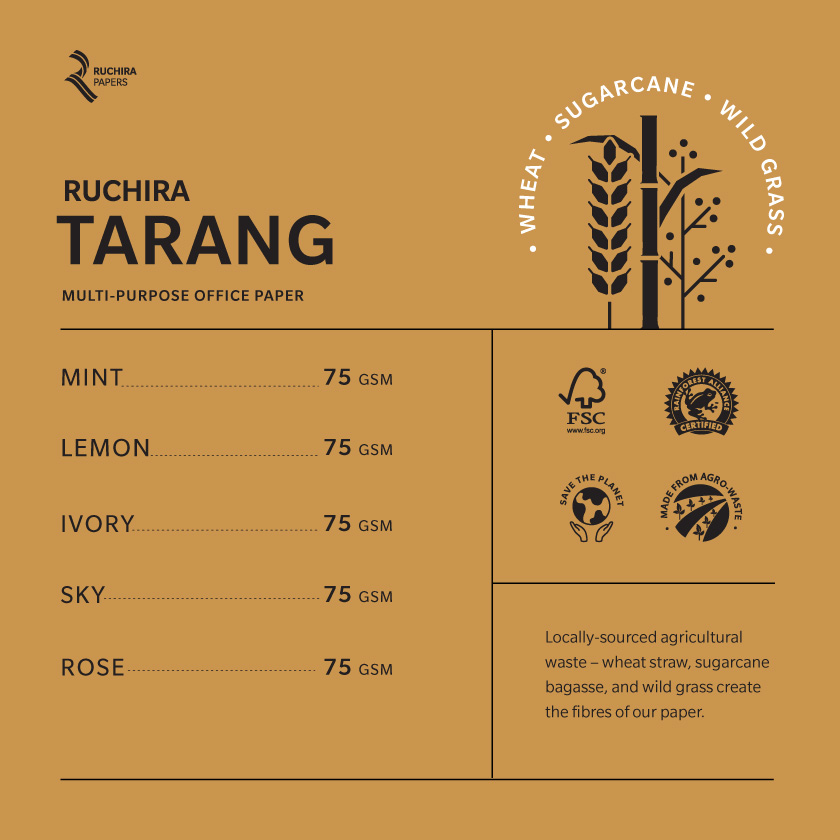
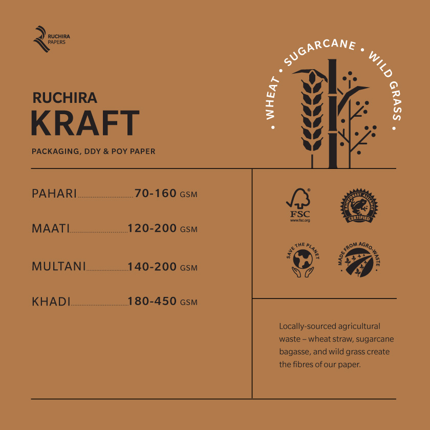
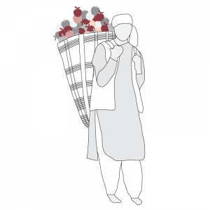
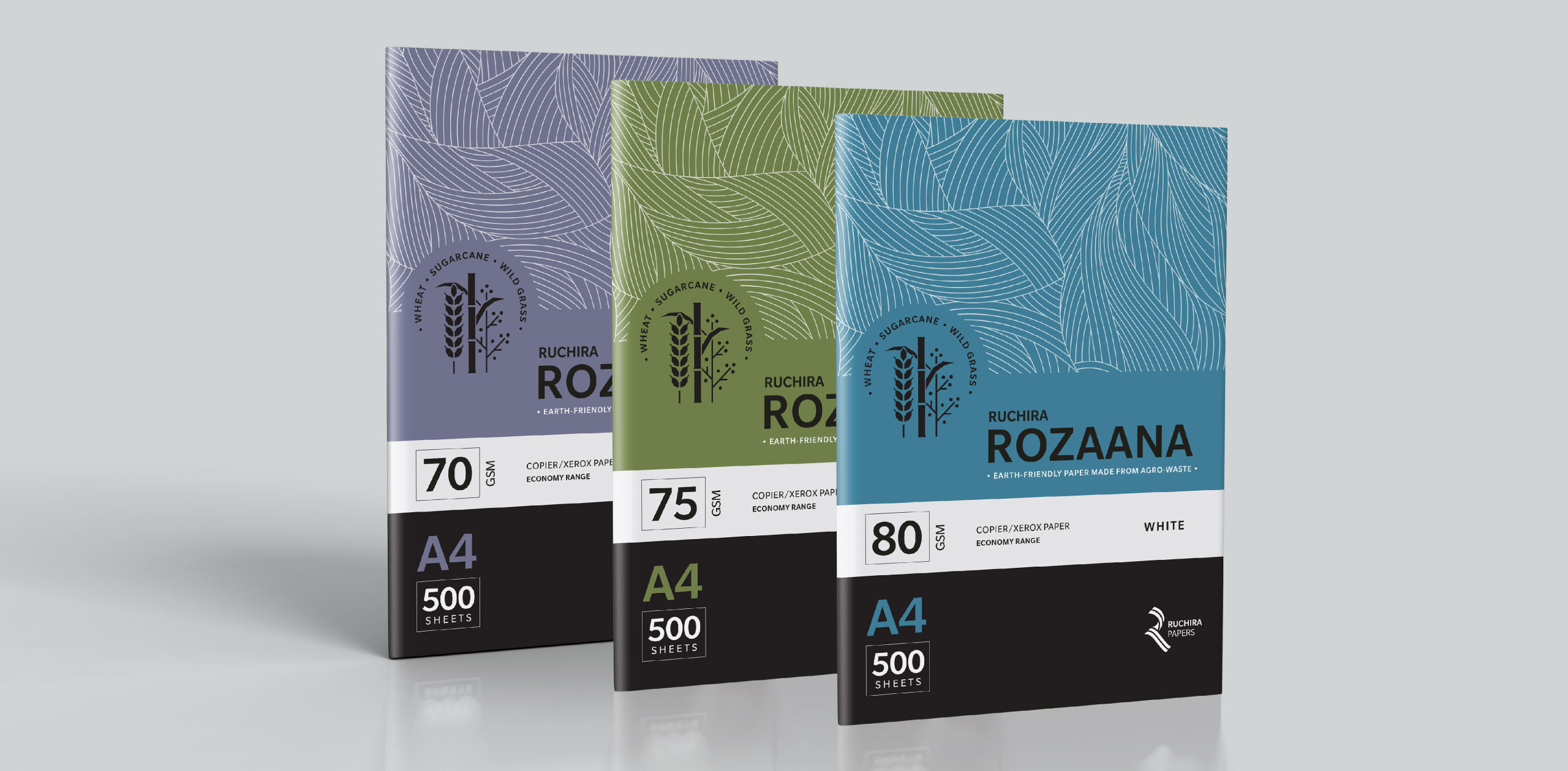
Over the last 35 years the company had been actively investing in green engineering and the local community. It was an interesting ecosystem: farmers who supplied the raw material, dealers who sold reams of paper B2B and even suppliers who used it to pack the famous Himachal apples. A compelling story was already there. We just had to make it visible.
![]()
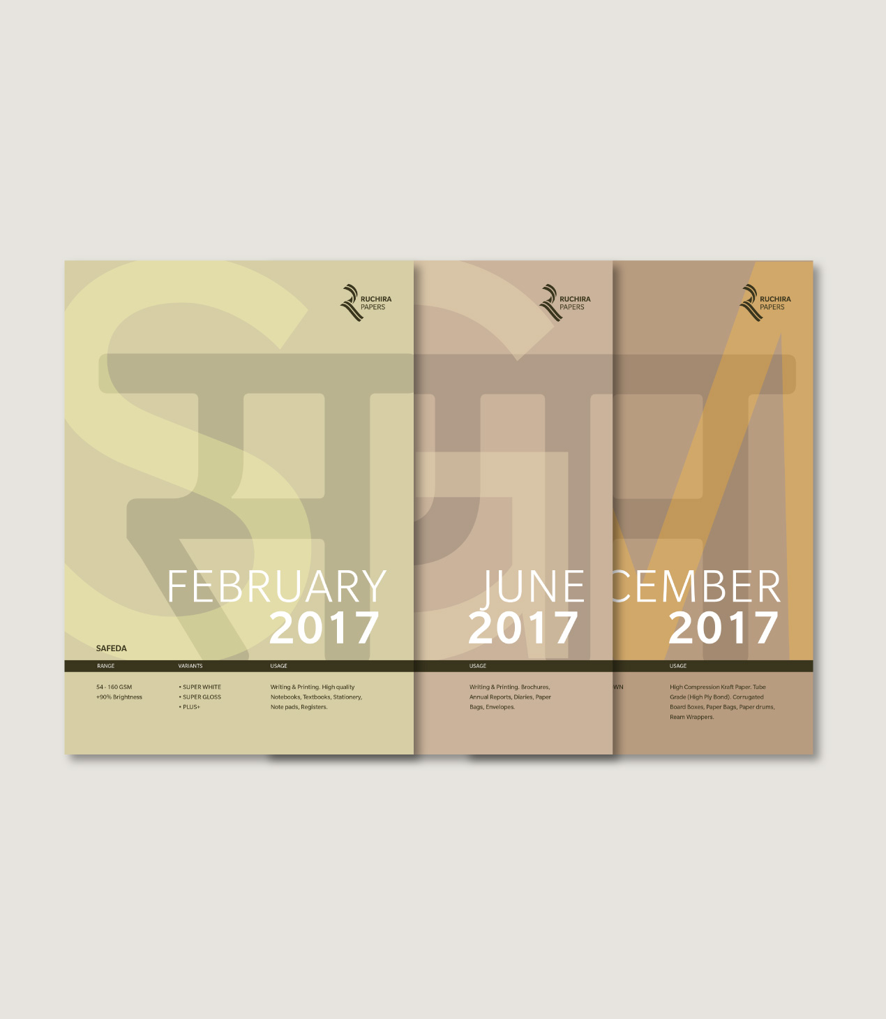
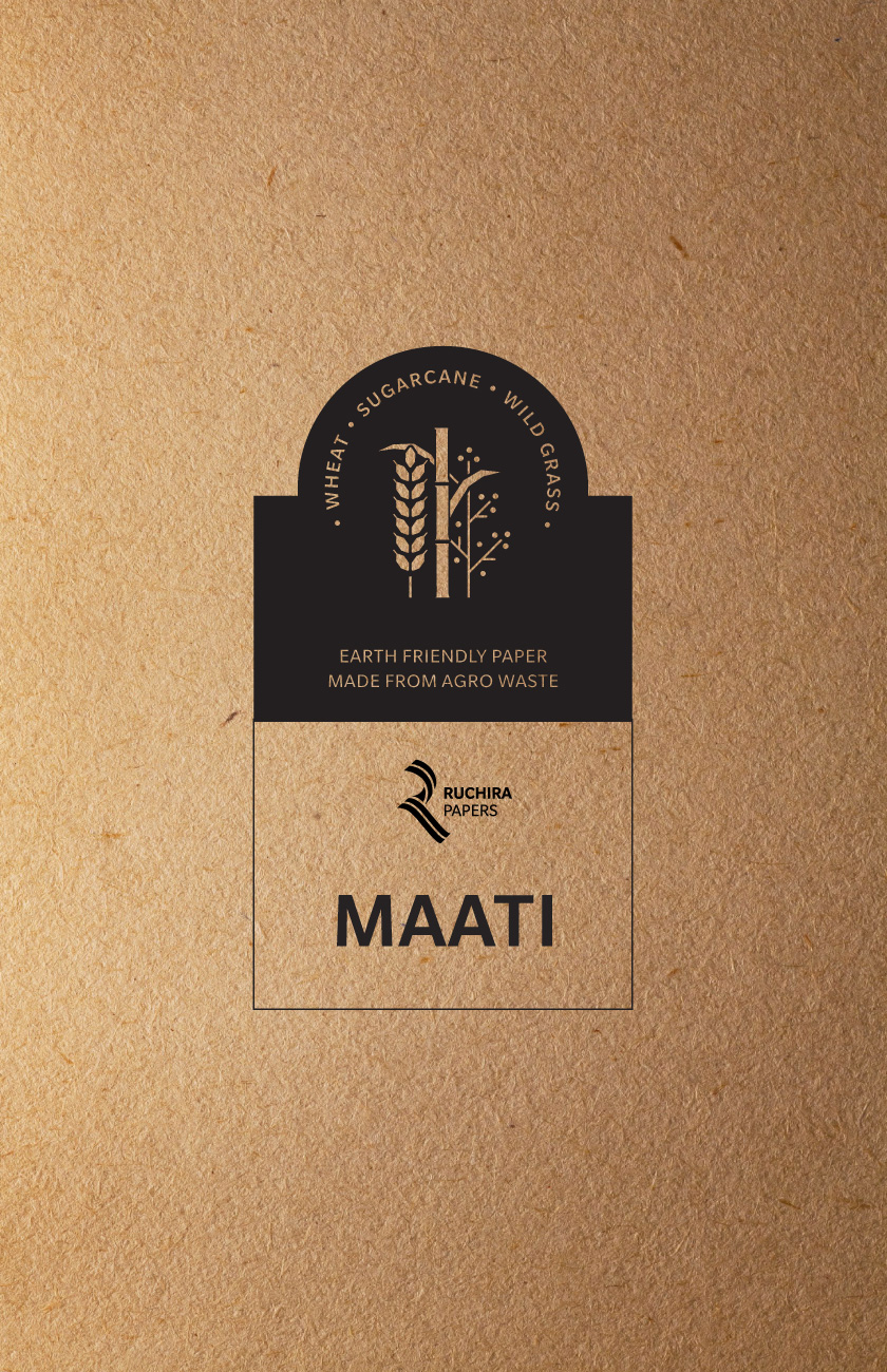
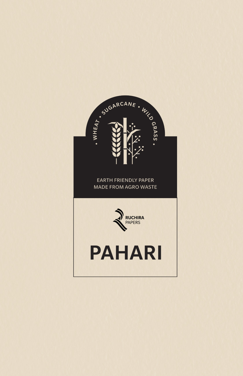
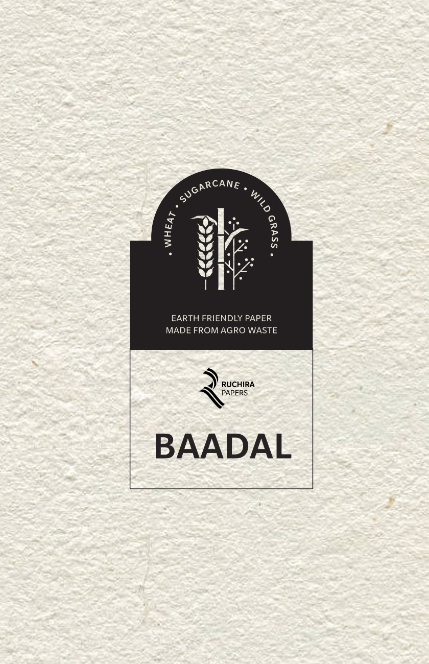
Originally named ‘Classic’, ‘Replika’ and ‘Super White’ the products though high quality were lost in a sea of generics. They needed a clear brand recall – a strong connect to where they come from and what makes them special. Along with the identity, the entire product line was renamed and brand language redesigned to align with their larger vision.